- Survey settings
- 360 feedback display settings
- 360 feedback display labels
- 360 feedback display configurations
- 360 feedback introductory text
- 360 feedback - show hide question logic
- 360 feedback - skip logic
- Custom Marker and Building Block
- Scorecard customization
- 360 Surveys- Rich Content Editor
- 360 Surveys- Priority Model
- 360 Surveys- Presentation Text
- Track and Display Subject Actions
- Multi Level Priority Logic

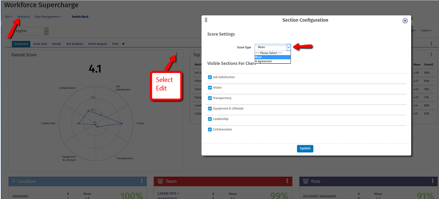
Customizing Spider Graphs - Mean Vs. % Agreement Top Box Scoring
Lately we’ve found ourselves tinkering with our Workforce Data Visualization platform in an effort for businesses to seamlessly make sense of a large quantity of data. With spider graphs, Human Resource managers can visualize employee performance data on a single chart. This helps to quickly identify and act on emerging trends within their workplace.
To get an idea of how we measure and report findings - let’s take a step back and understand the underlying reporting values of a standard six-scale agreement, called Bipolar Likert Scale. The scoring logic is set by default 1-5 with a score of 0 for not applicable responses.
For organizational leaders to make highly informed decisions, there are two powerful ways to interpret and manipulate data in real-time. This is by Mean (Spider Graph) and % Agreement Top Box Scoring. After survey responses are collected, results are displayed on QuestionPro’s Analytics Dashboard using an intuitive spider graph.
This has become extremely popular with an annual cultural survey which team members evaluate the company by mapping cultural value sets against each other. Using QuestionPro’s dashboard, a HR manager can gain insights to morale and identify any gaps which will may be inhibiting growth.
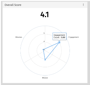
Mean (Spider Graph)
The mean uses every value in the data in a sample population. For that reason, the mean is a good representative of underlying data. Ironically, since a mean is an average of a set of numbers we typically do not find in this value in the raw data.
To interpret a spider graph, a user needs to first identify the scale. In the example below, the axis represent the common six point Likert agreement scale. By hovering over data points, we reveal the overall sentiment of the team is high engagement which is indicated by the highlighted data point is touching the outermost rim. Since the data points are plotted on the same two dimensional chart, management can derive that more attention is needed around mission and morale initiatives. The overall mean score is incredibly powerful when data is compared and contrasted over time.
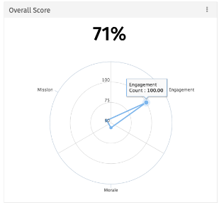
% Agreement Top Box Scoring
Top-box scoring systems main benefit is simplicity and quickly assessing results. In the absence of benchmarks or historical data, managers look at so-called top-box scoring. You might be asking yourself how QuestionPro groups values into "top box". It’s actually quite simple - we tally the number of respondents which mark Agree and Strongly Agree.

To understand the sample population’s level of agreement - we’ve coupled top box scoring with percentage of agreement. The idea behind this practice is that scores strong attitude with a statement are highlighted. For example, in our example of a cultural study the manager will infer that as a whole team members(100%) feel strong sense of employee engagement and which draws attention to areas of improvement, such as, mission and morale.
Keep in mind spider graph mapping is extremely versatile and can also be applied to a variety of employee surveys.
Go to: Workforce >> Analytics >> Edit (Overall score)