- Survey settings
- 360 feedback display settings
- 360 feedback display labels
- 360 feedback display configurations
- 360 feedback introductory text
- 360 feedback - show hide question logic
- 360 feedback - skip logic
- Custom Marker and Building Block
- Scorecard customization
- 360 Surveys- Rich Content Editor
- 360 Surveys- Priority Model
- 360 Surveys- Presentation Text
- Track and Display Subject Actions
- Multi Level Priority Logic

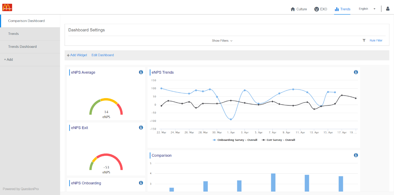
Workforce Trends
Workforce trends will give you an ability to create 3 widgets
- Overall average
- Time trend
- Comparison chart
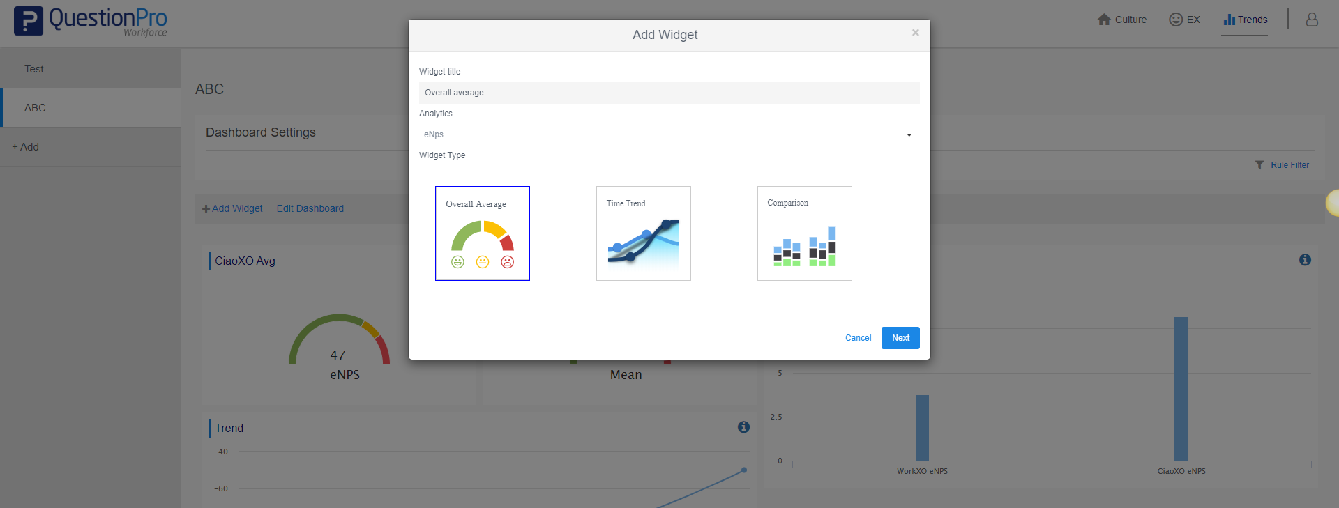
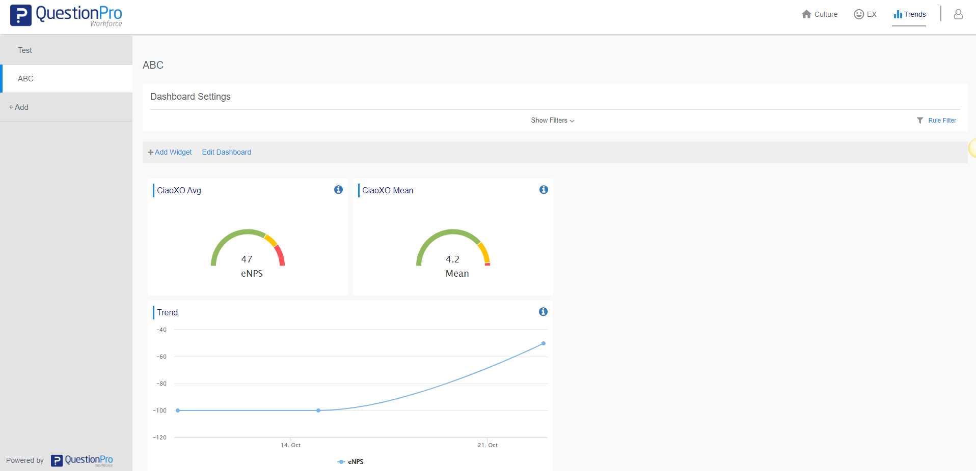
To create an overall average widget
- Go to: Workforce employee portal » Trends
- Click on Add Widget
- Select the chart type as Overall Average
- Select the survey, deployment and items (for mean and prominence analytics) to view the overall average widget
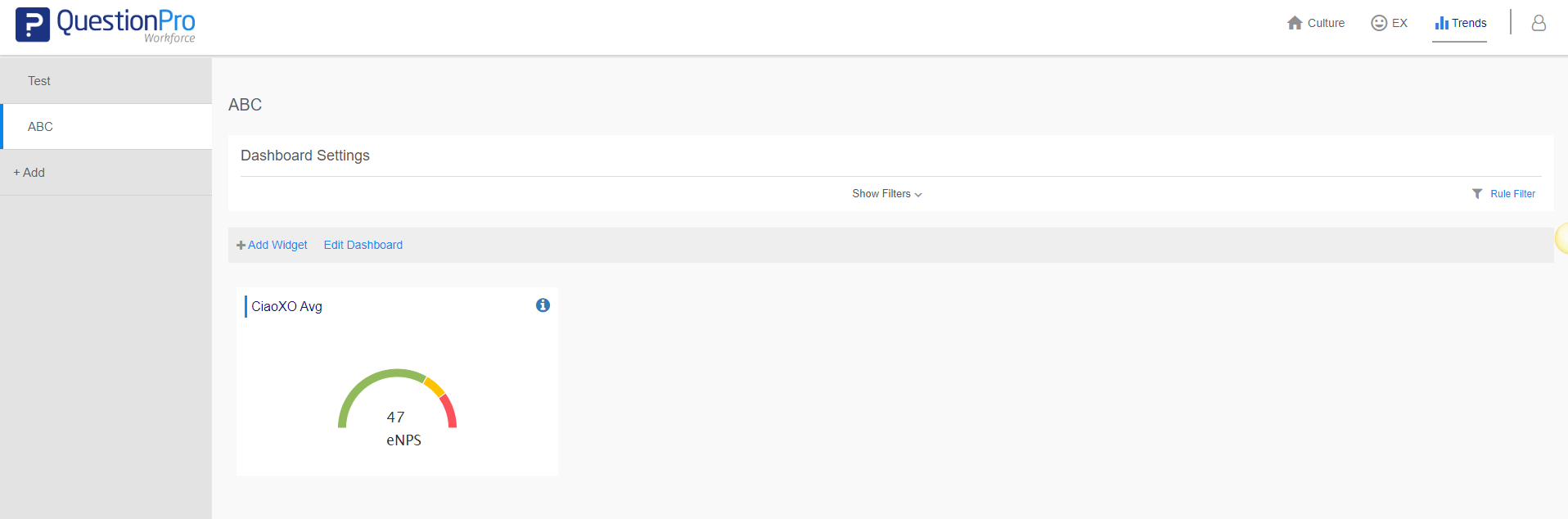 Click on edit dashboard to resize, move and delete the widget
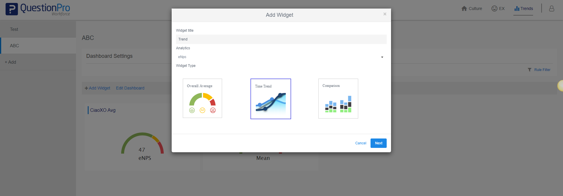
To create an time trend widget
- Go to: Workforce employee portal » Trends
- Click on Add Widget
- Select the chart type as Time Trend
- Select the survey, deployment and items (for mean and prominence analytics) to view the overall average widget. You can select multiple survey in time trend.
- View your time trend widget
 Click on edit dashboard to resize, move and delete the widget
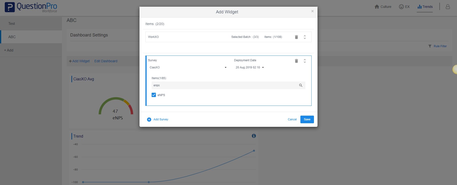
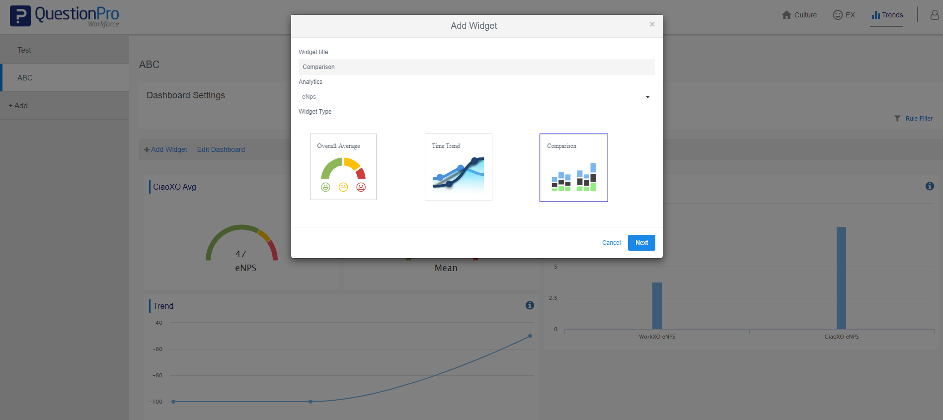
To create an comparison widget
- Go to: Workforce employee portal » Trends
- Click on Add Widget
- Select the chart type as Comparison
- Select the survey, deployment and items (for mean and prominence analytics) to view the overall average widget. You can select multiple survey in comparison widget.
- View your comparison widget
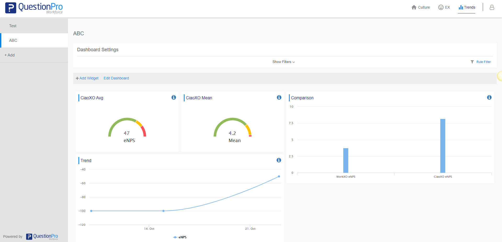 Click on edit dashboard to resize, move and delete the widget
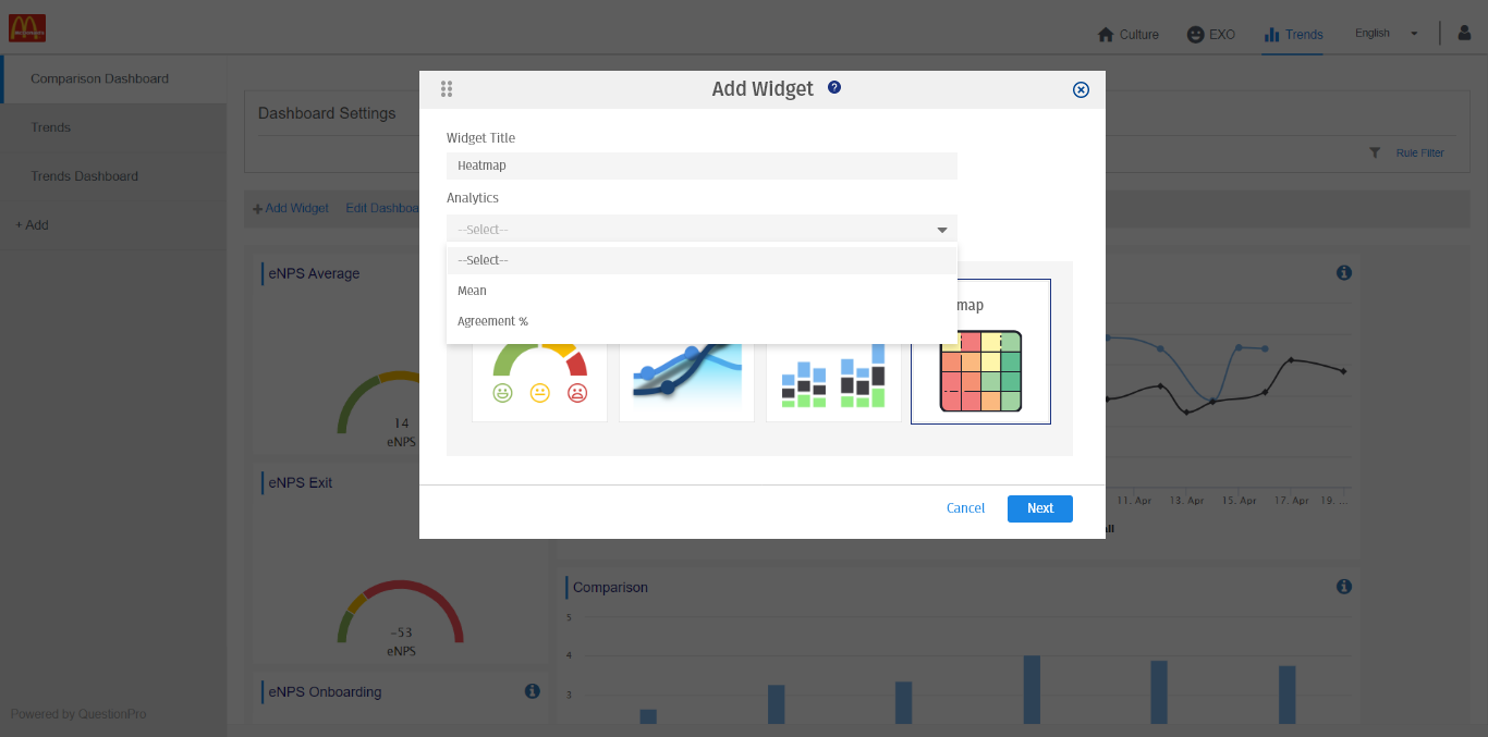
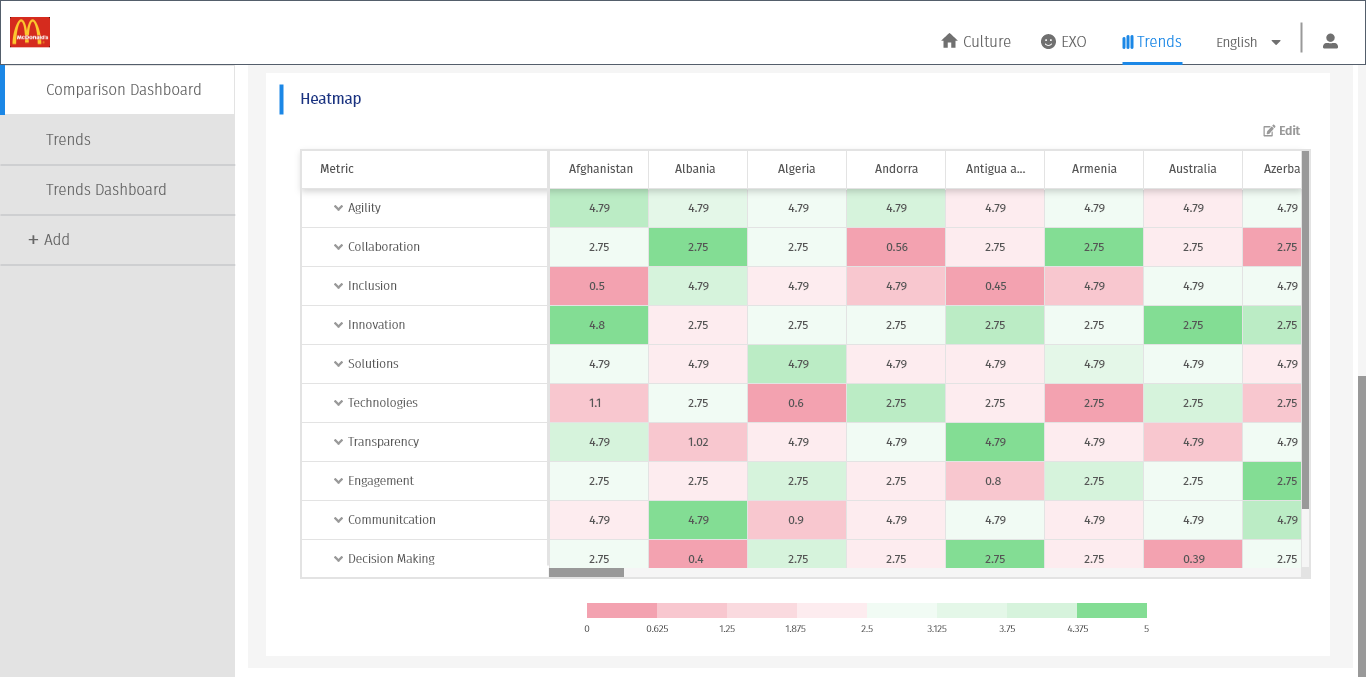
Demographic comparison can be seen through a new heat map widget on the dashboard. Data in the heatmap widget can be represented as a mean or agreement percentage. The values will be color coded ranging from the highest to lowest value for specific behavior, with red being the lowest mean/agreement and green being the highest mean/agreement,yellow falling in the middle. To create a Heatmap
- Go to: Workforce employee portal » Trends
- Click on the Add Widget button to add the heatmap widget on your dashboard.
- Select the chart type as Heatmap
- Select the Analytics select if you want to compare means or agreement percentages. Click on the Next button to continue.
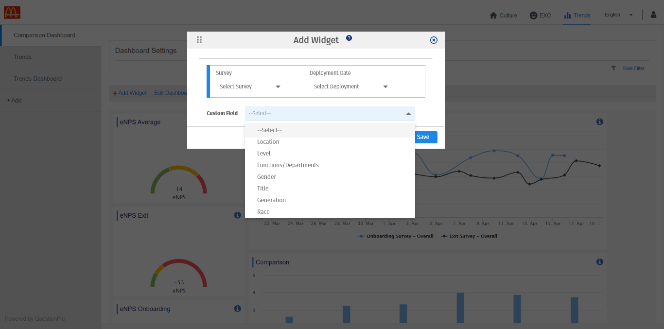
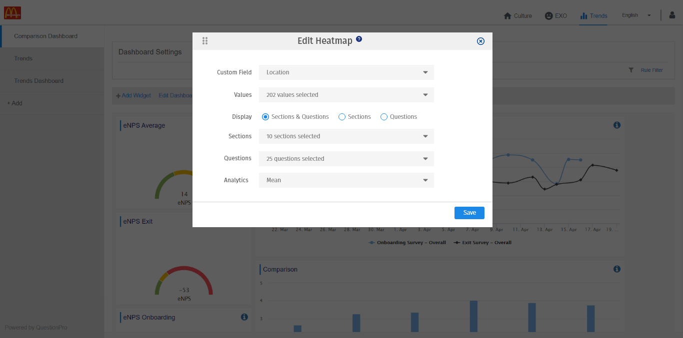
- Choose the survey and a deployment date on this screen. Then, Select the custom field from the dropdown list to create a heat map.
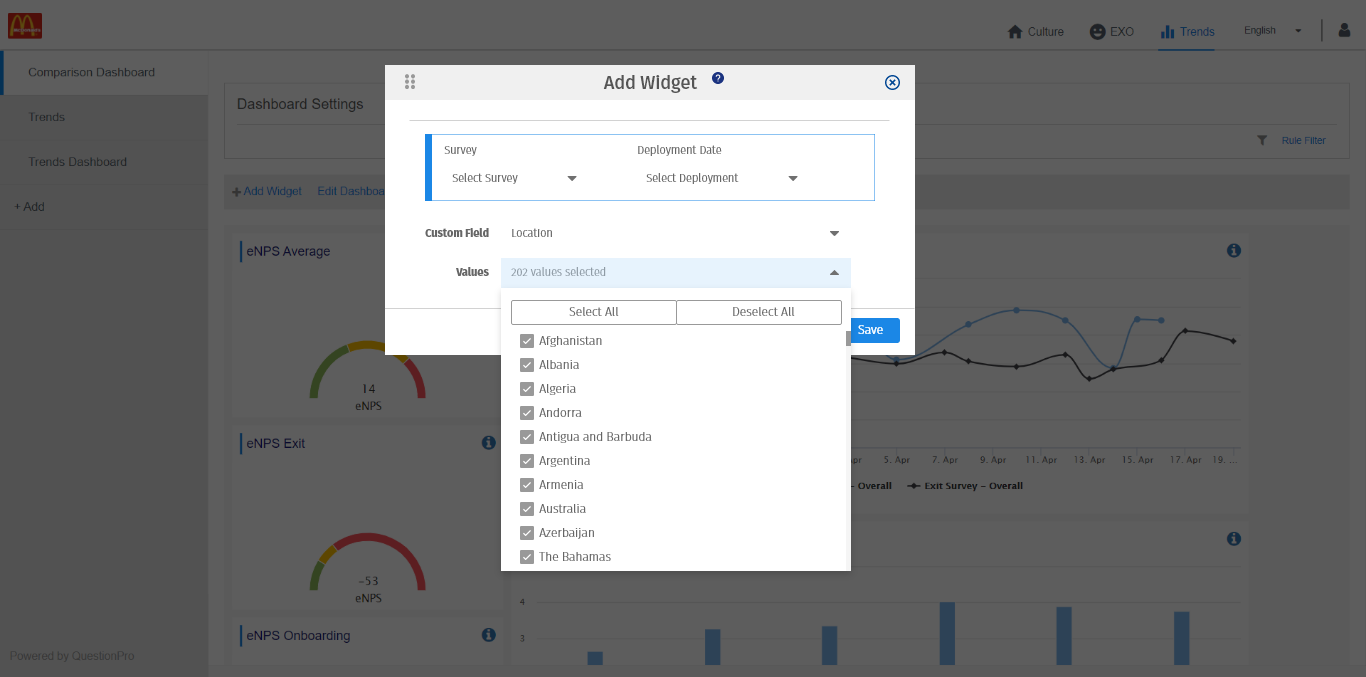
- Under values, you can select if you want each segment of the demographic compared, or you can choose only specific ones for comparison.
- The heatmap will be generated based on selected demographic values to show the responses.
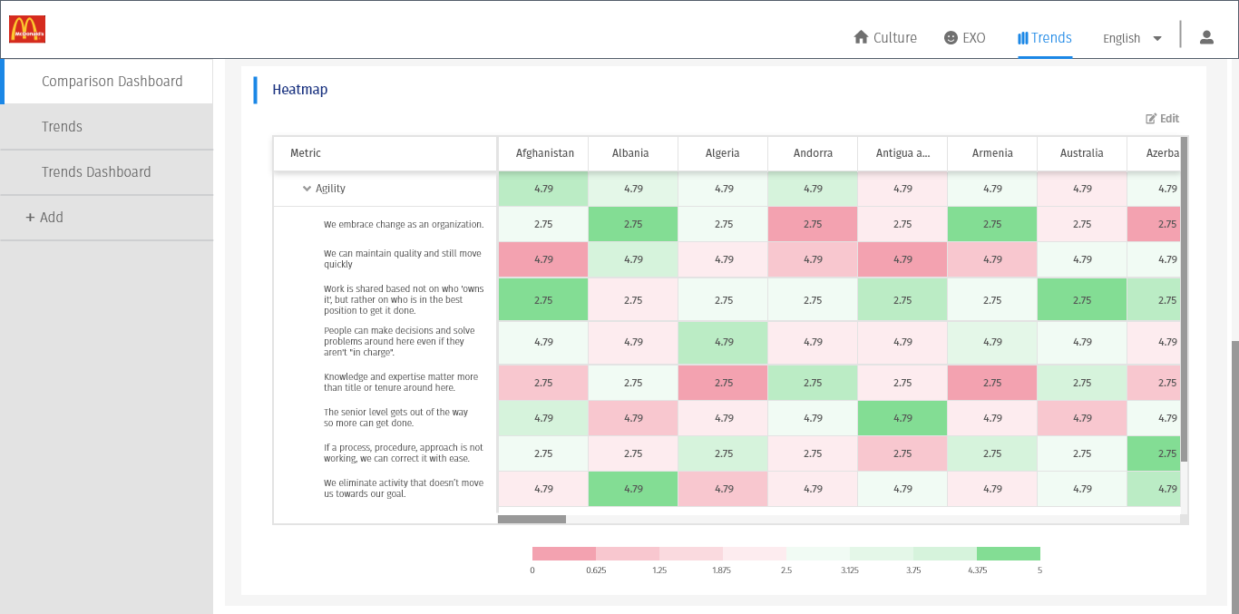
- To see subsections of each metric as the expanded view, click on the down arrow and you will see the specific items.
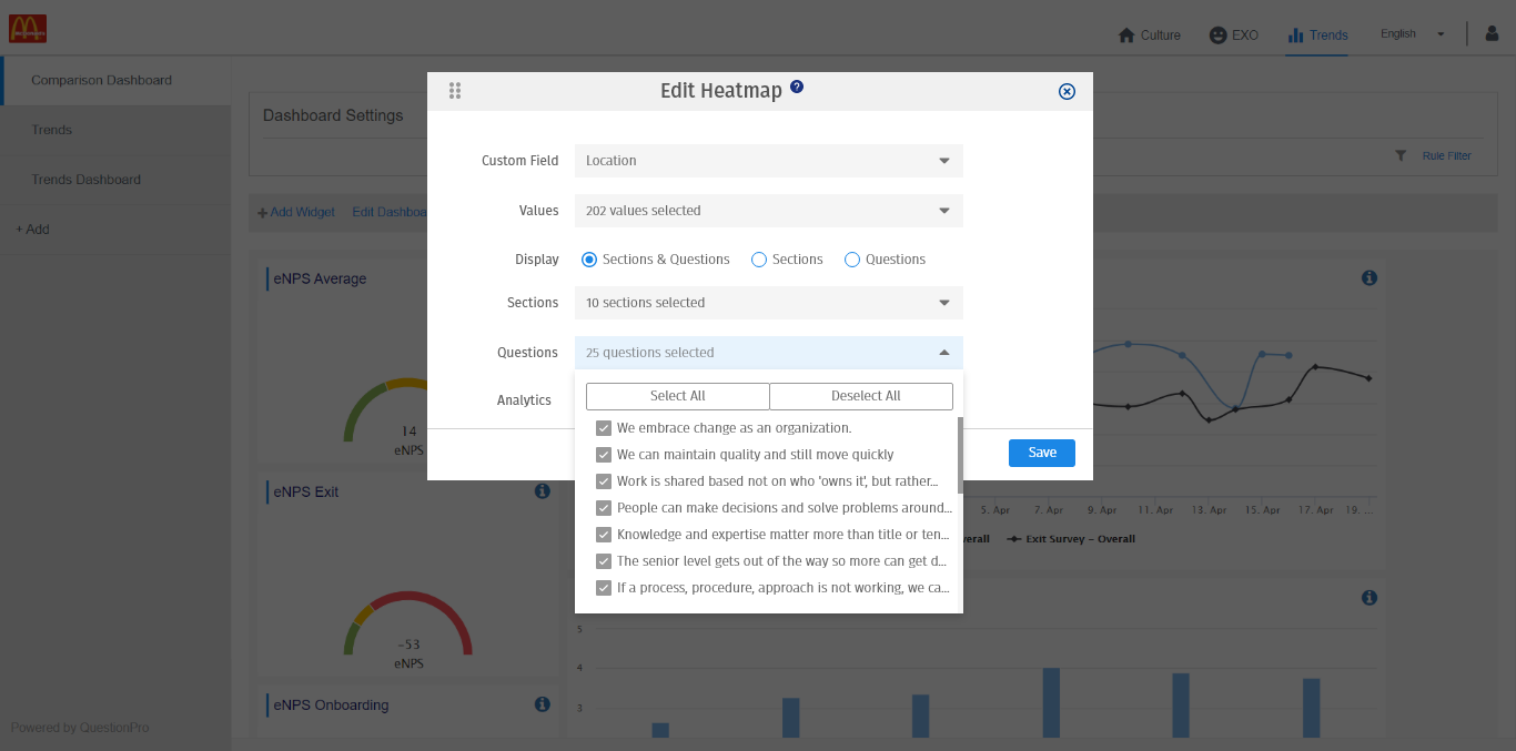
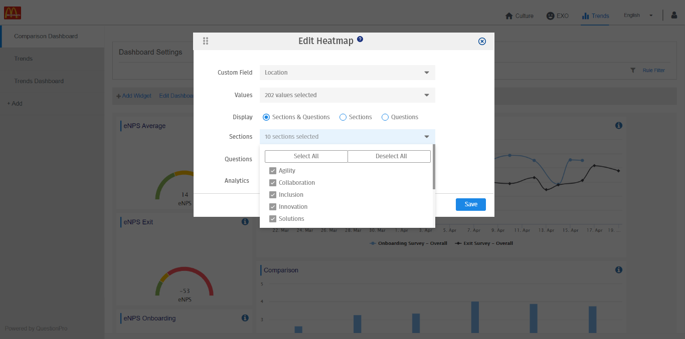
- Click on the Edit option on the top right of the heatmap to modify the heatmap view and the sections.
- For example, click on the Sections dropdown to select or deselect the section.