A wide range of ready-made reports with filters to make the most of your survey results.
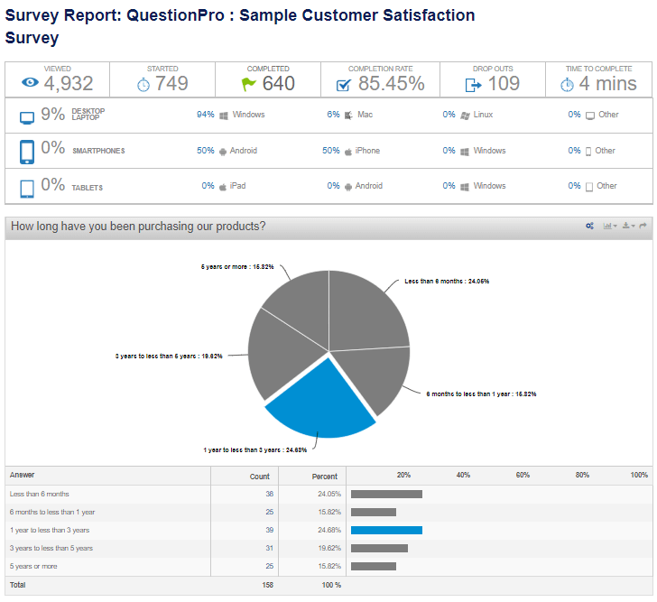
Real-Time Summary Report
The Real-Time Summary Report is the most basic report of up-to-date survey results. The report consists of simple frequency statistics and basic graphs of the data collected.
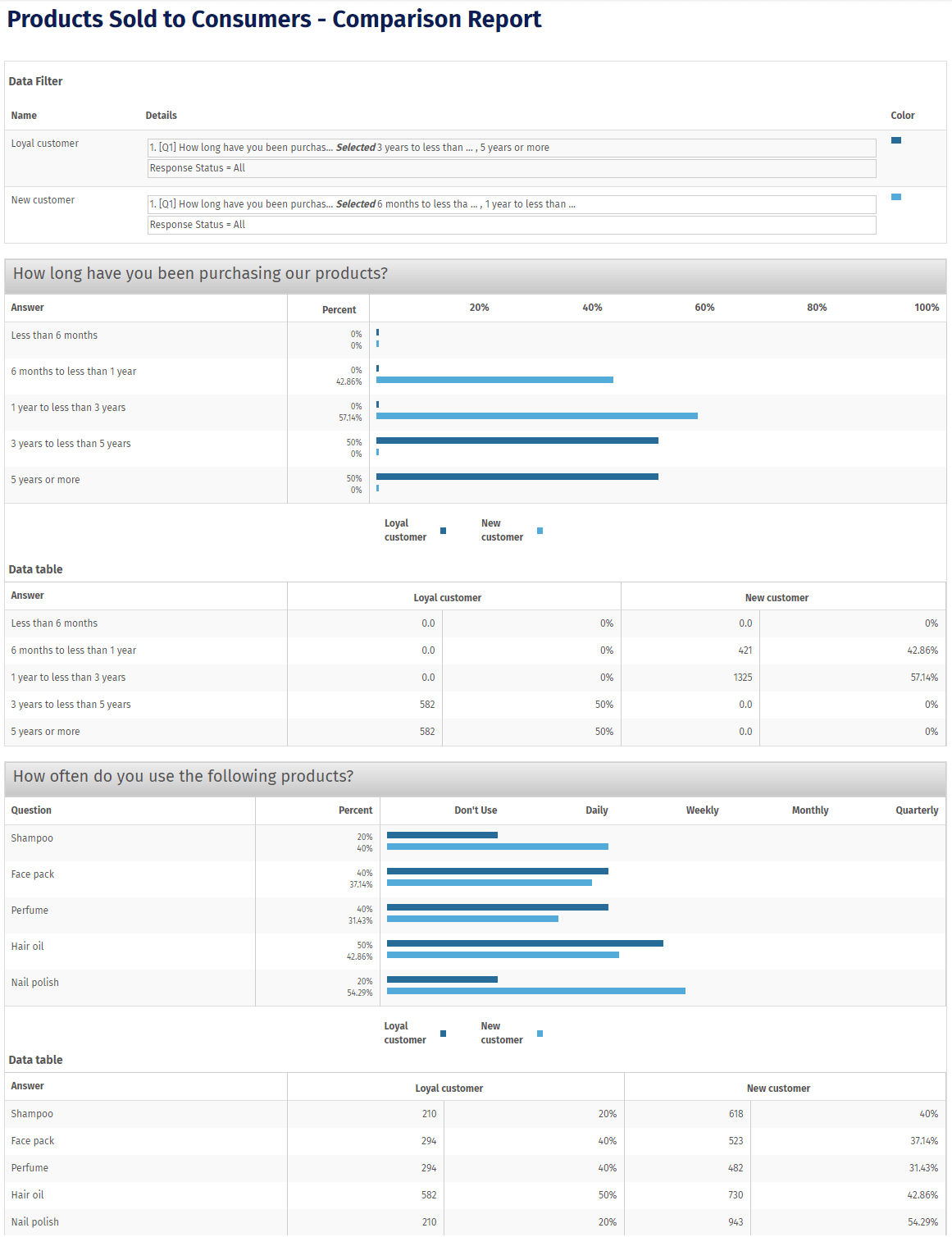
Online Comparison Report
After viewing the entire dataset in the online summary report, the most common requirement is to compare the results of the survey for different groups of survey respondents. This report will show overall results as well as results for each group that you have defined.
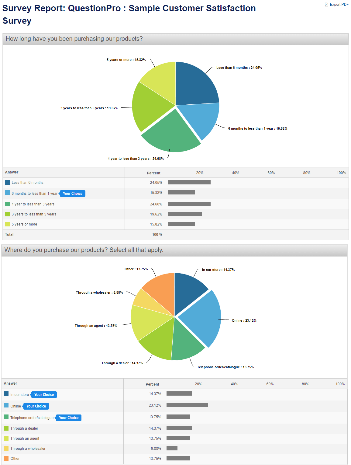
Spotlight Report ™
The spotlight report allows your respondents to visually see how their responses compared to the overall survey responses.
Individual Response Viewer
In many cases, the analysis of data requires you to drill down all the way to one particular survey response. From any point in the online analysis, you have the option to query the responses and bring up a list of survey responses that you may view 1 by 1. The data includes the IP Address, Date/Time, and any custom variables you may have collected for the respondent.
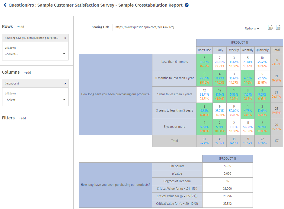
Cross-Tabulation
The cross-tabulation tool allows you to measure the interaction between two or more categorical variables. The table will only show respondents that answered all the questions, meaning the frequencies shown may differ from a standard frequency table. The cross-tab report will also show Pearson’s Chi-Square Statistics, which shows the level of correlation between the variables using the chi-square, p-value, and degrees of freedom along with Row percentage,Column percentage and highlighted most significant cells.
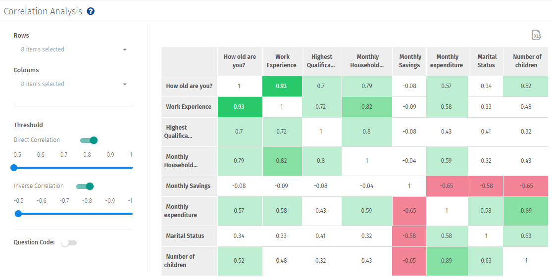
Correlation Analysis
The correlation analysis tool allows you to measure the strength of association between two variables and the direction of the relationship. In terms of the strength of relationship, the value of the correlation coefficient (rs) varies between+1 and -1. As the correlation coefficient value goes towards 0, the relationship between the two variables will be weaker. The direction of the relationship is indicated by the sign of the coefficient; a + sign indicates a Direct relationship and a – sign indicates a Inverse relationship.
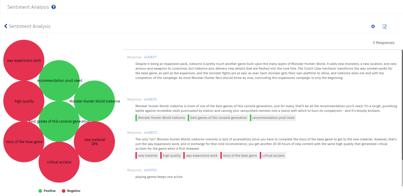
Sentiment Analysis
Sentiment Analysis refers to the use of natural language processing, text analysis, computational linguistics, and biometrics to systematically identify, extract, quantify, and study affective states and subjective information. Sentiment analysis is widely applied to the voice of the customer materials such as reviews and survey responses, online and social media, and healthcare materials for applications that range from marketing to customer service to clinical medicine.
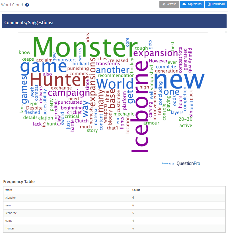
Word Cloud
A word cloud (or weighted list in visual design) is a visual depiction of user-generated tags, or simply the word content of a site, typically used to describe the content of web sites. Tags are usually single words and are normally listed alphabetically, and the importance of a tag is shown with font size or color. Thus, it is possible to find a tag alphabetically and by popularity.
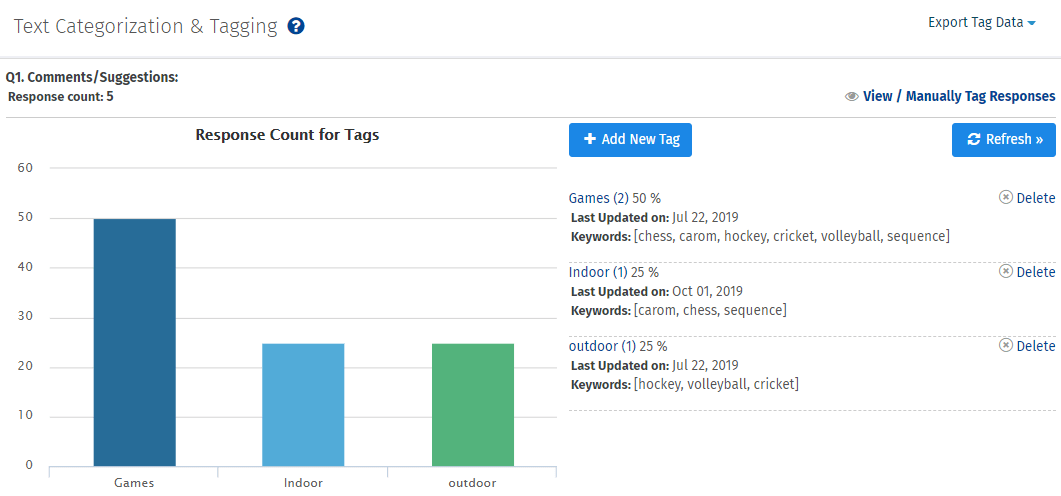
Text Categorization & Tagging
The text analysis tool allows you to create a tag for open ended text and categorize the data based on the tags. Text Category can be set up on an Open Ended Text - Comments Box type question. User can mention the keywords to tag and our system will auto tag those responses. User can also go for manual tags and run the analysis on text categorization.
MaxDiff Analysis
MaxDiff is a methodology developed by Jordan Louviere et al., that results in interval scale measurements that are based on comparative judgments that can be easily performed, even when the number of attributes is not small. The task presents respondents with a set of items, usually 3 to 6, and simply asks them to select the most preferred and the least preferred in the set. This method is also referred to as Best/Worst scaling.
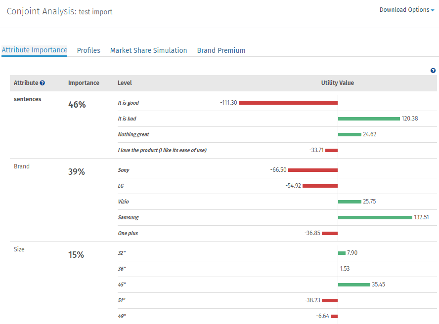
Conjoint Analysis
Conjoint Analysis is one of the most effective models in extracting consumer behavior into an empirical or quantitative measurement. It evaluates products/services in a way no other method can. Traditional ratings surveys and analysis do not have the ability to place the "importance" or "value" on the different attributes, a particular product or service is composed of. Conjoint Analysis guides the end user into extrapolating his or her preference to a quantitative measurement.
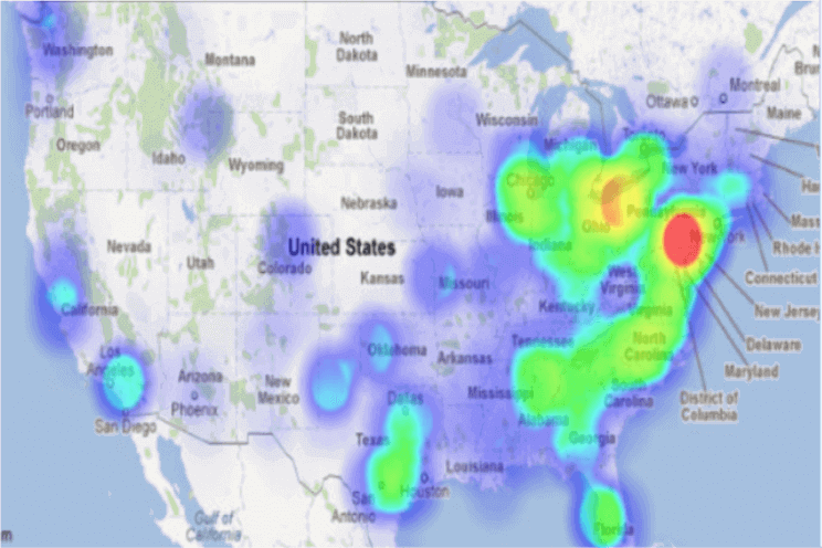
HeatMap Analysis
A heat map is a graphical representation of data where the individual values contained in a matrix are represented as colors. Fractal maps and tree maps both often use a similar system of color-coding to represent the values taken by a variable in a hierarchy. Heat maps help you get an instant feel for an area by grouping places into categories and displaying their density visually. The darker the color is, the higher is the density.
Trend Analysis
More Info
Studies that last over a period of time are often analyzed to determine how survey results vary over that time period. The Trend Analysis report gives you the ability to chart survey response data over time. The results can be charted weekly, monthly, or quarterly.
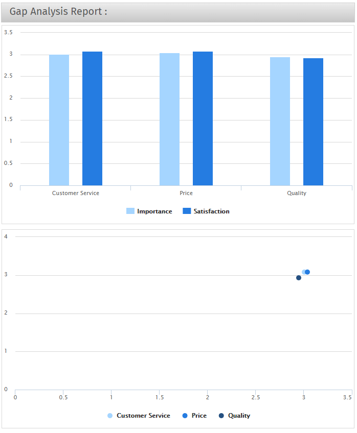
Gap Analysis
Gap Analysis is typically used to analyze the interaction of two scale type questions. The classic example is to present a respondent with a series of measurement items and two scales that rate the Satisfaction and the Importance of each item. Each rating scale starts at 1 for Not Satisfied/Not Important and goes to 5 for Very Satisfied/Very Important. Although the answers to each scale is important, the interaction between two scales is the critical information. This interaction answers "Which attributes are the most important AND how satisfied are my respondents with that attribute?". The answer to this question allows the prioritization of attributes by determining the Gap in two scales. QuestionPro automatically performs this analysis on a side by side matrix type question.
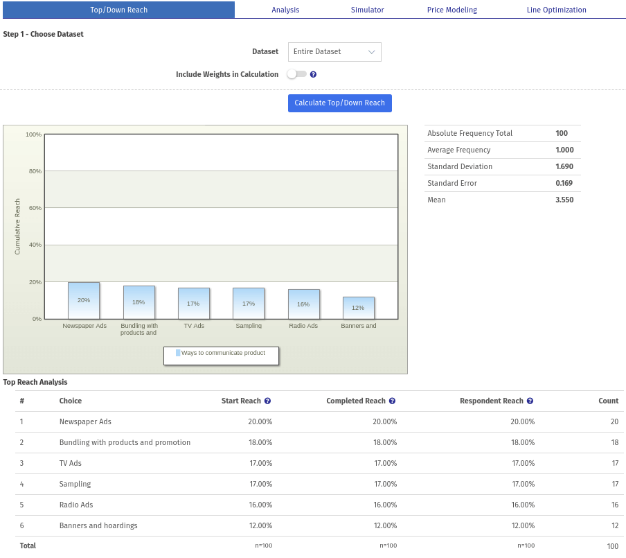
TURF Analysis
TURF (Total Unduplicated Reach and Frequency) Analysis, is a type of statistical analysis used for providing estimates of media or market potential and devising optimal ways how to use it given the limited resources. For example, say you want to market 10 new flavors of yogurt. There may be ten possible flavors for a new yogurt, but in actuality the market will only purchase three. The TURF algorithm identifies the optimal product line to maximize the total number of consumers who will purchase at least one SKU (Stock Keeping Unit) and, at the same time, minimize consumer overlap across all the flavors. This in turn can help companies determine which products / services to offer, and just as importantly, what products not to make.
 Survey Software
Easy to use and accessible for everyone. Design, send and analyze online surveys.
Survey Software
Easy to use and accessible for everyone. Design, send and analyze online surveys.
 Research Suite
A suite of enterprise-grade research tools for market research professionals.
Research Suite
A suite of enterprise-grade research tools for market research professionals.
 CX
Experiences change the world. Deliver the best with our CX management software.
CX
Experiences change the world. Deliver the best with our CX management software.
 Workforce
Create the best employee experience and act on real-time data from end to end.
Workforce
Create the best employee experience and act on real-time data from end to end.